

What do your brand colors really say about you?
(and are they saying what you want them to say?)
You’re familiar with the idea that your brand is more than just a logo, right? Your visual and experiential brand is a living, breathing reflection of who YOU are, what you stand for, and how you want your audience to feel when they interact with you.
But here’s something many creative businesses overlook:
The colors you choose are quietly shaping that perception, instantly.
Color psychology isn’t just for designers (hi!) or marketing gurus. It’s a powerful tool for any founder who wants their brand to resonate deeply with the right audience, especially if you’re building something with purpose, intention, and a whole lot of heart (which we know you are).
Let’s break it down.
Why color psychology in branding matters more than you think
Color is one of the first things your audience notices. In fact, studies show people make subconscious judgments about a product within 90 seconds (!!!) and up to 90% of that judgment is based on color alone.
Intentionally chosen brand colors can:
-
Spark trust or inspire bold action
-
Evoke a sense of calm or command attention
-
Speak “luxury and intentional” OR “approachable and fun”
…all before a single word is read.
So if your brand is meant to reflect your values, your audience, and the transformation you offer, it’s worth asking yourself:
“Are my brand colors aligned with the emotional experience that I want my clients to have when working with my business?”
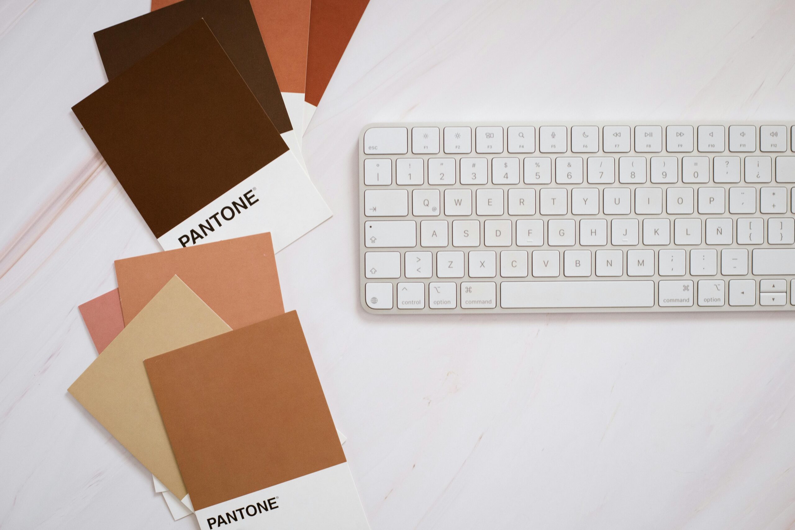
What Different Colors Can Say About Your Brand
Here’s a quick look at what some of the most common brand colors tend to evoke, and why they might (or might not) be right for your business:
-
Blue: Trust, stability, professionalism
→ Great for service-based businesses that want to inspire confidence and clarity.
Perfect for: coaches, consultants, wellness brands, and financial consultants. -
Green: Growth, renewal, balance
→ Ideal for businesses tied to nature, wellness, or personal growth.
Perfect for: holistic health coaches, organic products, eco-conscious brands, and therapists -
Purple: Creativity, spirituality, luxury, royalty
→ Perfect for brands that blend soulfulness with sophistication.
Perfect for: brand strategists, intuitive healers, creative professionals. -
Pink: Compassion, femininity, optimism
→ Often used by women-led brands with a soft, nurturing voice, and bolder pinks can signal power and confidence, too!
Perfect for: beauty brands, life coaches, community-focused entrepreneurs. -
Black: Elegance, authority, timelessness
→ A chic choice for high-end, design-forward brands.
Perfect for: fashion labels, luxury services, personal brands with a minimalist edge, high-end realtors -
Yellow: Energy, positivity, warmth
→ Invites attention and joy, but can also feel overwhelming if the color is overused.
Perfect for: creative studios, product-based businesses, kid-focused brands. -
Neutrals (beige, taupe, cream): Sophistication, warmth, subtle strength
→ A timeless choice that blends well with accent colors.
Perfect for: lifestyle brands, interior design, artisan goods.
For Women in Business: Choosing Colors That Feel Like You
Between juggling clients, meetings, schedules, your personal life, and your next big idea, it can be tempting to choose colors that simply look pretty or follow trends – there’s nothing inherently wrong with doing that, but when your brand truly reflects your essence, and speaks to the clients you’re here to serve? That’s when your brand becomes magnetic.
Ask yourself:
-
What feeling do I want my clients to have when they land on my site?
-
What transformation do I help them achieve?
-
Do my current colors support that, or distract from it?
If your brand is warm and nurturing, but your palette feels cold and clinical? It might be time to rethink and realign with where you see your business going. Shamelss plug: our semi-custom brands take the guesswork out of choosing your colors.
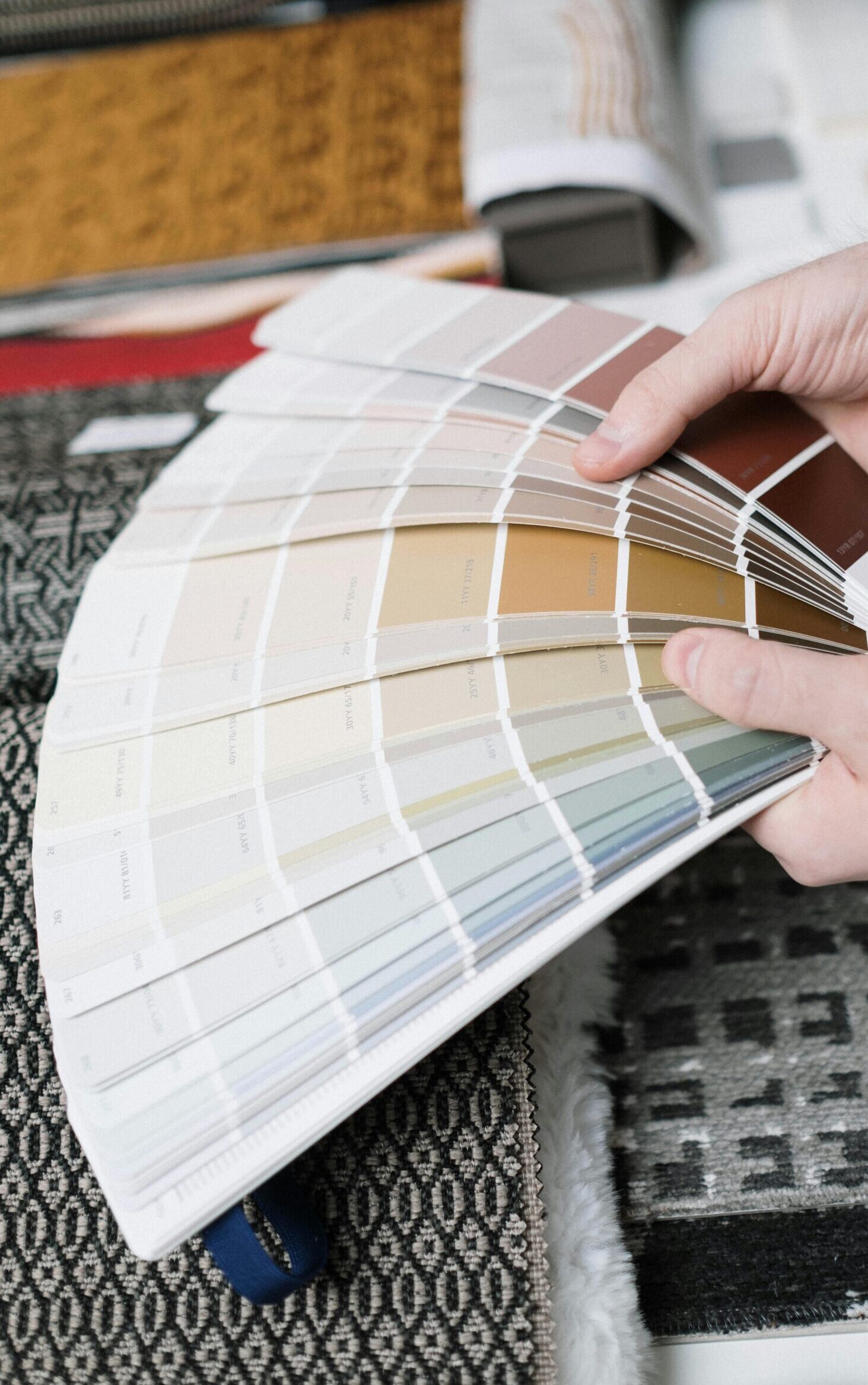
Pro Tip: It’s not just one color, it’s the entire Palette
Your brand doesn’t have to fit neatly into one “color personality.” In fact, the most memorable brands use a balanced palette:
-
One to two primary colors that lead the emotional tone
-
Three to Five Secondary colors to support and contrast
-
Neutrals to create breathing room and consistency
Think of your color palette like a wardrobe. It should reflect your personality, make you feel confident, AND work together beautifully.
If you want help defining a color story that feels like home…
-welcome to LYT Marketing! We help entrepreneurs build boutique brands that are both beautiful and strategically aligned. Whether you’re rebranding, refining, or just starting out, we’d love to help you discover your brand’s unique color voice.
✨ Ready for a brand that feels like you and attracts your dream clients? [Let’s Chat »]
Follow along on Instagram to get the latest updates on LYT Marketing!


Comments +